Redefining Excellence with a UX Makeover
Mede Analytics is an analytical platform that provides detailed reports and versatile analytical tools to Healthcare Providers and Insurance companies.


Despite offering robust functionalities, MedeAnalytics faced difficulty in attracting and retaining clients due to its outdated user interface (UI) and cumbersome user experience (UX).
The main issue was the platform's outdated UI/UX, which made user experience difficult and didn't meet modern design standards. Clients found it hard to learn and couldn't get quick answers to their queries. Previous attempts to redesign the product by internal teams and third-party vendors failed, leading to skepticism among stakeholders.

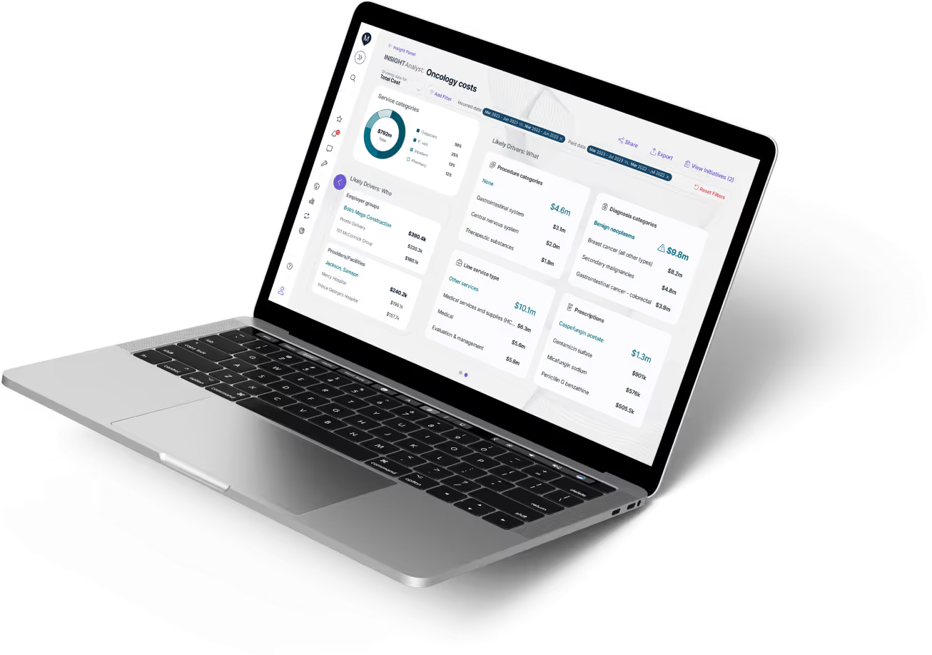
To address these issues, we prioritized the redesign of its dashboard. We made smarter use of space and streamlined the cluttered UI by reorganizing elements such as the navigation bar, report filters, and account-related functionalities.

.svg)
By prioritizing a visually appealing dashboard and addressing usability concerns, we exceeded expectations and delivered tangible value to both MedeAnalytics and its clients.