Thanks!
If you liked this, we would love for you to share it with more people.


Health apps rarely lose users because of one obvious flaw.
A user downloads the app, completes onboarding, and maybe even engages for a few sessions. On paper, everything looks like it’s working. The experience is smooth, the design is clean, and early engagement metrics are often encouraging.
And yet, despite this, usage can still drop shortly after.
For business owners and product teams, this is where retention becomes difficult to diagnose, especially when trying to understand why users abandon healthcare apps.
Pinpointing the issue becomes challenging because there is rarely one defining problem. Instead, small friction points across the experience start to compound over time.
Before we get into the specific issues, it’s important to understand one key idea:
improving app retention is less about adding more features and more about removing the friction that prevents users from forming habits in the first place.
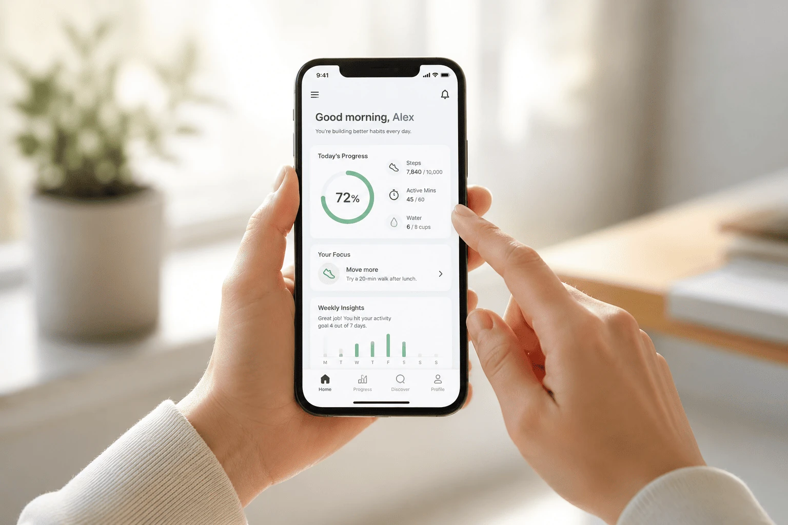
Health apps sit in a unique category. Unlike entertainment apps, they rely on consistency, motivation, and perceived progress over time, which makes health app engagement much harder to sustain. That means even small design flaws can have a large impact on user engagement in healthcare apps.
Now, let’s break down the common engagement killers in health apss that are likely costing your app active users and how to fix them.
Even well-designed healthcare apps can struggle with long-term engagement when small UX and product issues start to compound over time. In many cases, users do not leave because of a single major flaw, but because repeated friction points slowly reduce motivation, trust, and habit formation. Below are some of the most common engagement killers in health apps that contribute to poor health app retention, lower patient engagement, and increased app churn.
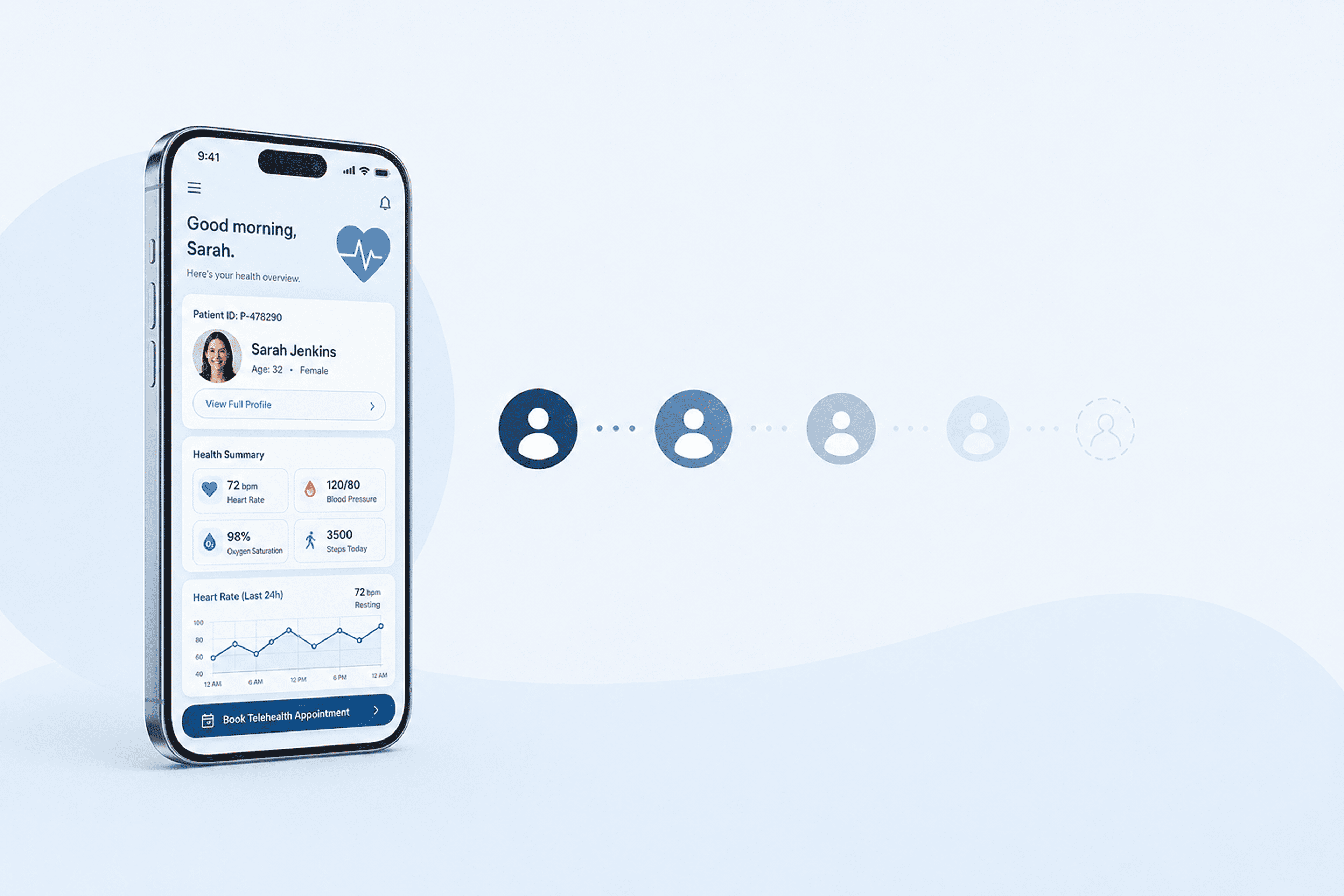
Healthcare apps frequently require identity verification and clinical history before a patient can access core features. However, front-loading every requirement creates an immediate barrier that drives abandonment before the first useful action even happens.
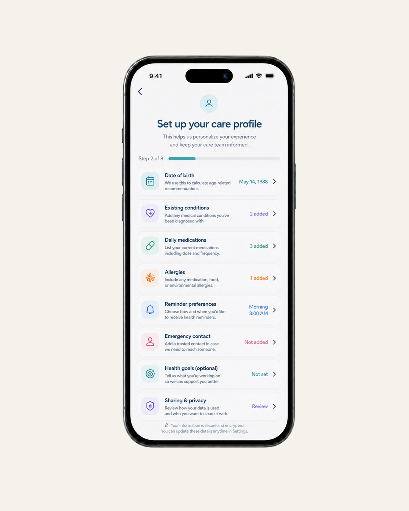
Patients should not have to go through a lengthy intake process just to book an appointment, view treatment options, or log a symptom, especially when early health app retention depends on fast value delivery. When setup is too demanding, the app fails to gain early traction and is less likely to become part of the patient’s routine.
A better approach is progressive onboarding. The app should first show value, whether by allowing patients to view available clinicians, browse treatment resources, or preview how symptom tracking works, before asking them to complete the full setup.
After that, reduce friction wherever possible. Smart defaults, such as preselected notification windows, common symptom categories, or saved location preferences, help patients move forward without configuring every detail themselves.
And instead of collecting everything at once, onboarding should happen in context. Ask for information only when it’s needed for the next action, and give patients the option to skip non-essential steps for now.
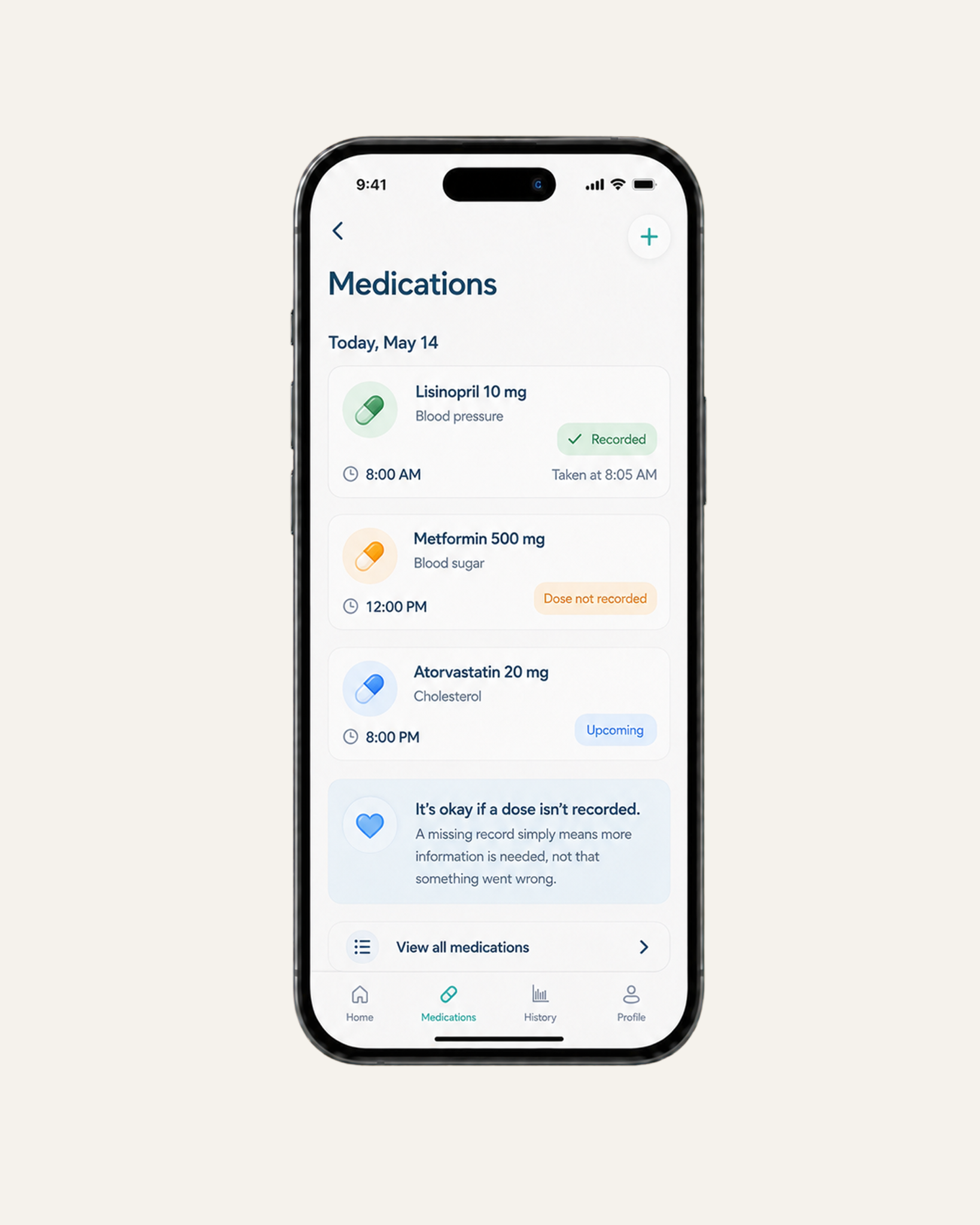
A missed symptom log or skipped medication reminder is rarely just a user error. Still, many healthcare apps respond with guilt-driven prompts or broken streaks. Instead of supporting re-engagement, this creates friction, making it harder for patients to return and continue.
A better approach is to focus on what the patient can do next. Instead of showing a broken streak, the app can use soft streaks that recognize previous consistency while giving patients room to restart. If a patient completes only part of a task, the interface should acknowledge the effort through partial credit instead of treating the action as incomplete.
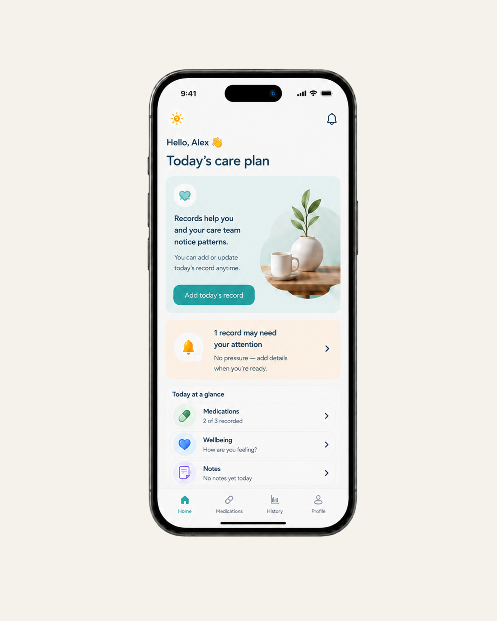
The app should also offer a simple recovery mode. If a patient skips several days of blood pressure tracking, the interface should prioritize today’s reading instead of surfacing missed logs or overdue alerts. It can also offer to adjust reminders around the patient’s current schedule.
Most importantly, the experience should remove shame-based UI elements as well. Red warnings, failure labels, and penalty-style prompts tend to push patients further away, especially when they already feel behind.
In many digital health apps, patients are asked to log symptoms, medication intake, or vitals, but nothing happens with that information from their perspective. The issue is not the data itself, but the lack of a defined purpose behind it.
When patient-reported inputs do not consistently trigger a decision, escalation, or update in care direction, they lose operational relevance, which can gradually weaken health app retention over time.
To avoid this, every data point should have a clear reason for existing. If an input does not help the care team make a decision, trigger a follow-up, or support a change in patient guidance, the tracker must be removed to protect the core value of the platform.
A reminder can either support a treatment plan or lead patients to disable notifications entirely. And honestly, most tech teams don’t realize how close they are to the second one.
Notifications are essential in healthcare apps because they help patients stay on track with medication, appointments, and ongoing monitoring. But the problem starts when these alerts are used as generic engagement prompts rather than being tied to clinical relevance, as they start to lose relevance for patients.
When this happens, patients begin to experience notification fatigue and disable alerts altogether, which can contribute to reducing churn in digital health apps. In effect, over-notification undermines the long-term purpose of the platform and weakens health app retention.
To prevent this, every alert must be tied to a specific action.
Patients should also have control over reminder types, timing, and frequency. A patient managing medication may need strict dose reminders, while a patient receiving general information may prefer fewer updates.
For lower-priority messages, such as weekly progress notes, content suggestions, or general app updates, teams can use digest notifications instead of separate alerts. Smart throttling can also reduce alerts when a patient is already active or when repeated reminders are being ignored.
Your health app should not sound like a wellness blog.
Tips like “drink more water” or “get more sleep” aren’t wrong, but they don’t add much value in a clinical setting. Patients can get that kind of advice anywhere, and most of them already do.
From a product perspective, this is where healthcare app UX starts to lose clinical relevance. If guidance is not tied to a patient’s condition or treatment plan, it has little impact on behavior, no matter how accurate it is.
Therefore, effective guidance must connect to a patient’s specific condition or recent behavior. To that end, every insight should help the patient understand their progress or their next step in care.
An app that tries to solve every problem usually ends up solving none.
AI assistants, content hubs, dashboards, or advanced tools all start as valid ideas. But if those features compete with the core treatment task, the product becomes harder to navigate at the exact moment patients need clarity.
Every healthcare app has a core loop. For example, if the app is built for medication adherence, the core loop should be simple: view the dose schedule, confirm intake, and track progress. If it is built for appointment management, booking, preparation, and follow-up should stay front and center. In both cases, every added feature should strengthen that loop, not distract from it.
To keep the core task clear, teams should design around the core loop first. From there, advanced tools, detailed reports, AI assistants, or content libraries should appear only when they support the patient’s next goal.
Goal-based UI filtering can also keep the experience focused. A patient tracking symptoms should see different shortcuts from someone managing refills or preparing for a telehealth visit. That way, each screen has one clear primary action, especially in high-friction moments where patients need to complete a task quickly.
Finally, teams should review low-engagement features regularly to simplify the experience and improve health app retention. If a feature is rarely used, does not support the core loop, or creates more confusion than value, it should be simplified, hidden, or removed. Feature depth can strengthen a health app, but only when it protects the core treatment task instead of burying it.
Teams invest heavily in UX, yet many healthcare apps still experience retention drop after initial use. The problem is, usability and retention are being treated as the same problem when, in practice, they are not.
From a system design perspective, the core issue is the absence of an enforced behavioral loop. A user completes a task, exits the flow, and nothing in the system naturally triggers the next meaningful action. As a result, each feature behaves independently, with no system-level dependence that drives continued use.
A loop only exists when one action directly affects the next. For example, a medication confirmation updates adherence status, which affects future reminders. A symptom log triggers a follow-up threshold. A missed action changes how the system responds the next time the user opens the app.
This is also where gamification is often misunderstood. In strong healthcare systems, it is not about adding visible game mechanics like leaderboards or badges. It is about how the system handles continuity of behavior. That means preserving progress across sessions, accurately reflecting both completed and missed actions, and ensuring the system responds based on a patient’s history rather than treating each interaction as isolated.
A lot of teams building healthcare apps still think in terms of screens, features, and individual interactions. But patients don’t experience it that way.
You can make every step easier and still fail to create repetition. Because retention in healthcare is not built on task completion, but on continuity—whether the system remembers what happened, reacts to it, and shapes what should happen next.
Once you see it that way, the question changes. It’s no longer “how do we make this easier to use?” but rather “what in this product actually creates a reason for the next interaction to exist?”
And in most healthcare apps, the honest answer is: not much.
%20copy.webp)
.png)

.webp)