Thanks!
If you liked this, we would love for you to share it with more people.


You only get seconds to prove you’re worth a patient’s time. Many of these early drop-offs are caused by common mistakes in healthcare apps—from clunky flows to unclear onboarding and poor UX decisions.
Trust is harder to earn when users are managing fatigue, stress, or illness, so low retention carries even more weight. In health app development, it typically leads to four common problems:
Customer acquisition cost (CAC) in healthcare is notoriously high due to narrow segments, complex compliance messaging, and longer sales cycles. If they drop off after one use, your customer acquisition cost just doubled or tripled.
When engagement drops fast, it’s hard to tell if the product is flawed—or if onboarding, messaging, or UX are to blame. This slows roadmap decisions and weakens the confidence of health systems looking for long-term adoption.
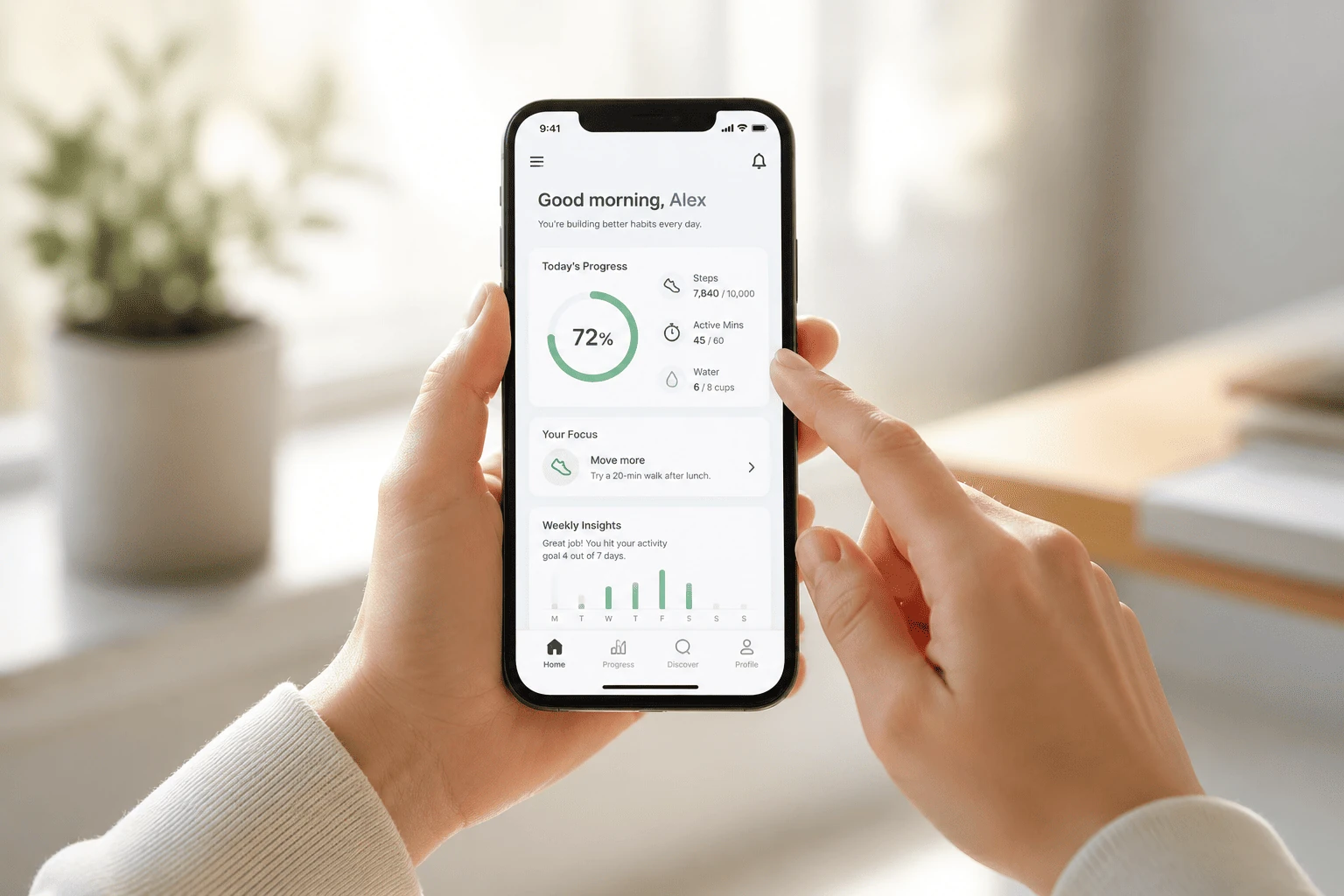
Without sustained usage, your data won’t have the statistical power needed to prove clinical impact or win over payers and enterprise buyers. Many teams struggle because they aren’t tracking what users actually do. A simple first step is to actually see what users are doing in your app—tools like Google Analytics and Hotjar can show you where they click, get stuck, or drop off. Once you understand their behavior, you can start improving retention and outcomes.
If your model relies on recurring use—whether subscriptions, referrals, or engagement-based revenue—churn breaks the foundation before it’s built, even in robust digital health solutions.
So why do users drop off faster in health apps than in other industries?
Here’s what to watch for:
If your Day 1 retention is under 30%, or you’re seeing more than 50% of drop-offs happen before account creation, you’re likely losing users to UX friction, not your core value.
In the next section, we’ll cover the six UX patterns we see most often in underperforming health apps.
One of the most common mistakes we see in UX design and healthcare app development is designing for idealized users: people who are always proactive, tech-savvy, and engaged. Unfortunately, healthcare app users don’t always match that profile.
They’re tired. Anxious. Distracted. Sometimes, just trying to get through the day.
When we design for users who have all the time and energy in the world, we unintentionally alienate the very people the product is meant to support, which results in silent churn (a common challenge in medical app design).
.png)
To address this, it’s important to design with cognitive overload in mind. Stressed or distracted users benefit from interfaces that minimize effort through smart defaults, progressive disclosure, and clear contextual cues. The goal is to reduce friction and make it easy for them to pause and pick up where they left off.
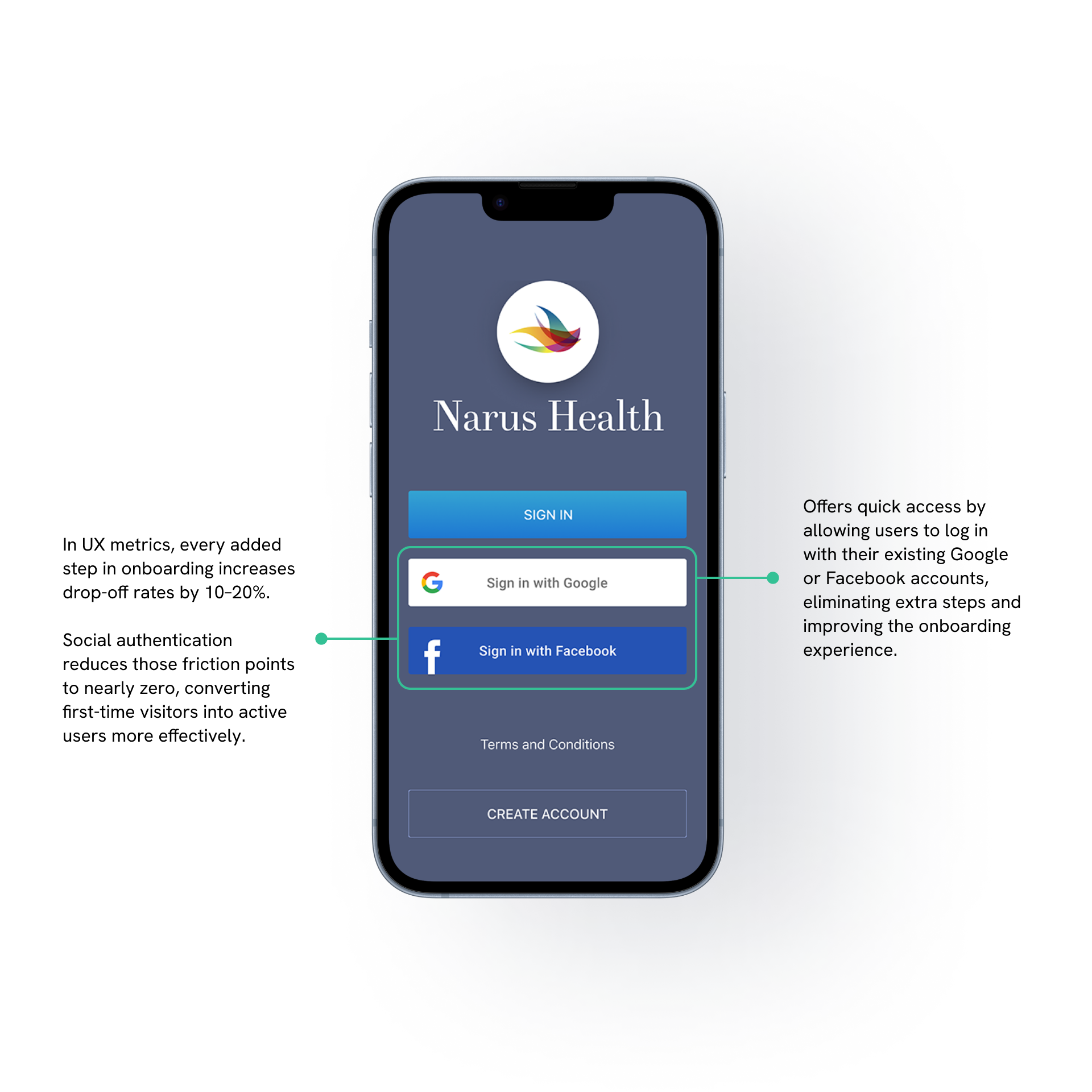
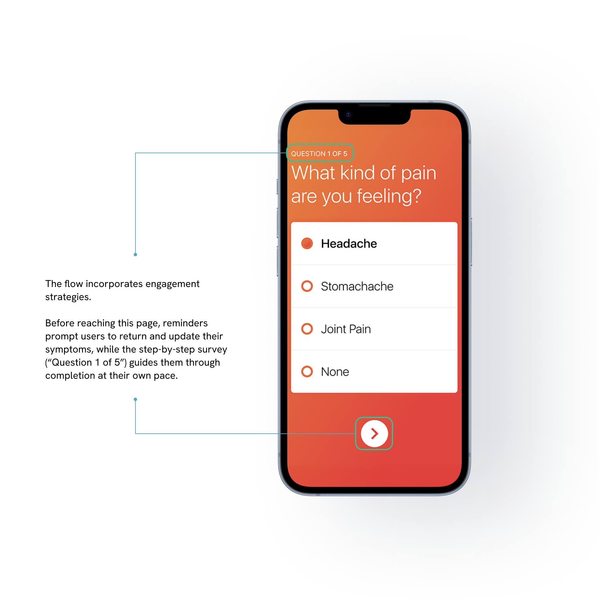
First-time use is the most fragile part of the product journey, especially in healthcare, where users often arrive under stress or urgency. Requiring too much upfront (forms, verification, consent flows) before offering any benefit breaks momentum.
First-time use is the most fragile part of the product journey, especially in medical app design, where users often arrive under stress or urgency. It’s like signing up for a gym and being told to complete a detailed health screening, choose a long-term plan, and attend an orientation just to use the treadmill. People don’t want to work that hard before seeing value.
The solution isn’t always to remove steps. It’s to space them out and offer clear choices.
What to do instead:
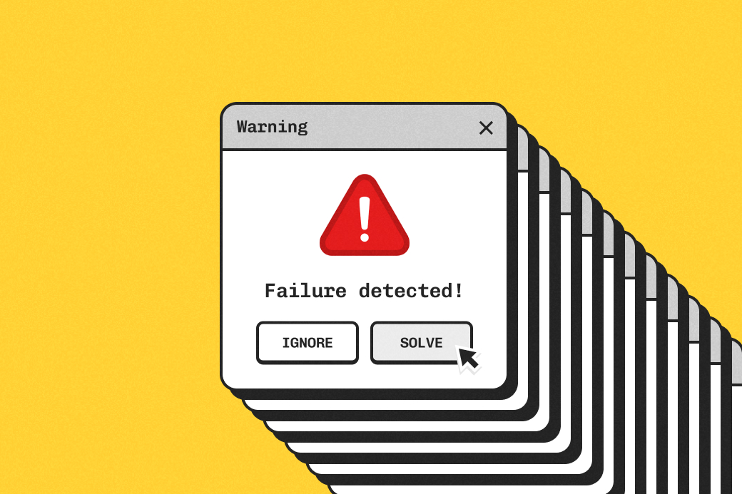
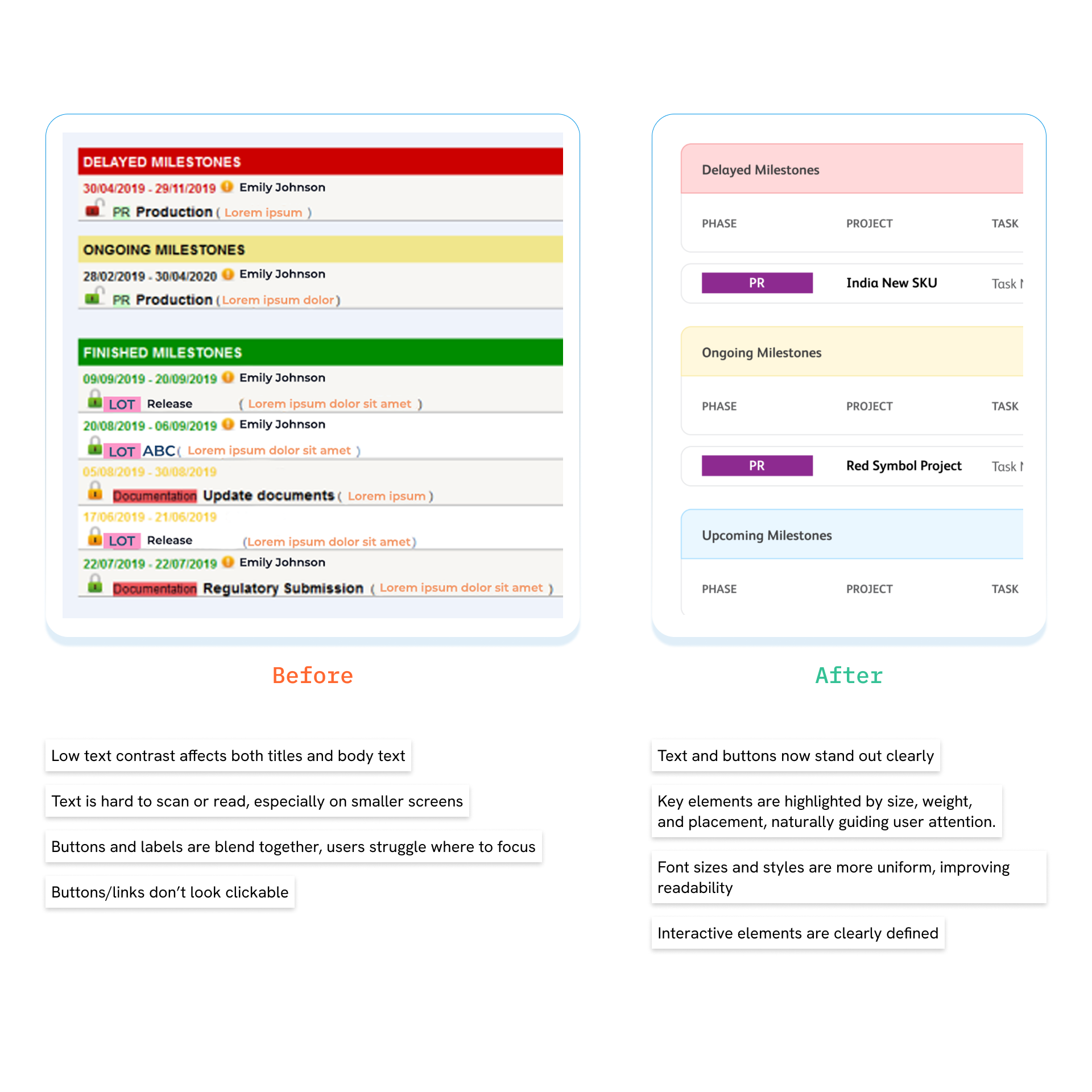
In most apps, bad UX might cost you a sale. In healthcare, a confusing flow can delay a dose, prevent someone from logging a symptom, or cause them to abandon the process entirely. In many cases, the problem isn't just one thing. It stems from the combined friction of unclear user flows and overly complex dashboards.
Here’s how to reduce friction and cognitive load:
Fix confusing flows:
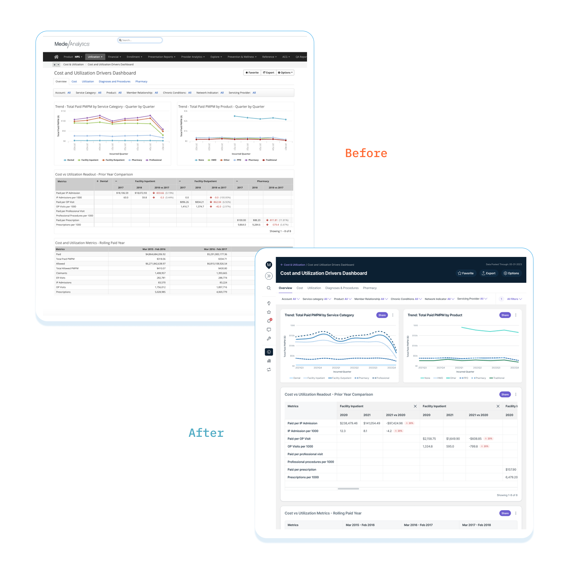
Declutter your dashboards:
If you’re leading product, engineering, or managing a patient engagement platform, retention is a metric you can’t afford to ignore. Most teams try to fix engagement problems by adding more. More features, more prompts, more content. The problem is, throwing more of these just adds complexity for the users. It dilutes the core value of your app and buries critical workflows under peripheral ones, making it harder for users to find what they need.
A better approach is to refocus: identify your primary use case and double down on it. Remove or sunset features that rarely get touched, and validate new ones with real usage data instead of chasing competitor benchmarks. Launching new functionality as optional modules or opt-ins can also keep the interface clean while giving power users more to explore.
Users with visual, motor, cognitive, or age-related limitations often rely on digital health solutions the most, yet they’re the first to be excluded by poor design.
Accessibility issues don’t always look dramatic. In fact, they show up in subtle but critical ways: tiny fonts, unclear buttons, low-contrast interfaces, and navigation that only works with touch. These might seem like minor oversights to designers, but to users, these determine whether the app is usable at all.
To make your app more inclusive:
The assumption is that if the app is valuable, users will naturally return. But health behaviors don’t work that way, especially in patient engagement software, where motivation fluctuates. Unlike social media or e-commerce apps, health tech isn’t designed for impulse use. People don’t log in just to browse. Whether it’s tracking symptoms, following a treatment plan, or monitoring progress, users need structured support to stay engaged and motivated, especially in digital health solutions. Otherwise, nothing is reinforcing the habit.
For more expert advice on designing effective notifications, we've shared some practical tips in our LinkedIn post, or explore our gamification deck for practical tips and examples you can apply right away.
Retention problems don’t fix themselves. They start as subtle friction—a delayed activation, a skipped feature, a confused user—and snowball into churn before you catch it. In healthcare, where onboarding often comes with authentication hurdles and trust barriers, the drop-off curve can be steep.
To improve retention, you first need to pinpoint where and why users disengage. That means looking beyond vanity metrics and focusing on behavioral signals that reveal intent or friction.
Here’s what to track and what to watch for:
In chronic care or mental health apps, look at weekly engagement, not just daily.
What to segment by:
Watch for:
If users leave after setup or skip key features entirely, UX friction may be driving your mobile app churn rate. A simple Excel sheet can help your team monitor, iterate, and course-correct before drop-offs snowball.
It’s tempting to chase big visions, especially when product teams want their app to stand out. But in health UX, depth beats breadth. Instead of asking what more you can build, ask what you can simplify, clarify, or reinforce.
Start with one clear value. Deliver it consistently. That’s how you build trust and improve user retention.
Need a fresh perspective? Our team helps product leaders design simpler, stickier experiences in healthcare.
You can also reach out to our CEO, who has helped teams simplify workflows and improve user engagement in healthcare. Book a call here.
.png)

.webp)